Devlog #4: Presentation & Graphics
Now that there's core mechanics and stages that utilize them, its time to work on the presentation of the game
Currently the game has very basic and (hopefully) placeholder graphics made of differently sized rectangles used so that development can focus more on the actual gameplay, mechanics and stages that make up the core of the game. The plan is to hopefully redo the graphics of the game to have better art, though I cant say for sure if it will come to pass as I lack much art skills and I'm having trouble thinking of a style that would fit the game's ideas and concepts well
Fortunately there's more going on with the game's general presentation than there is for graphics specifically. For example there's a mini HUD for displaying how long it's been since the level started (or restarted) so you can contrast and compare with yourself in future or other's attempts at the stages, and there's a red arrow attatched to the player sprite so that it's always very clear what direction gravity is pulling in at any given time.
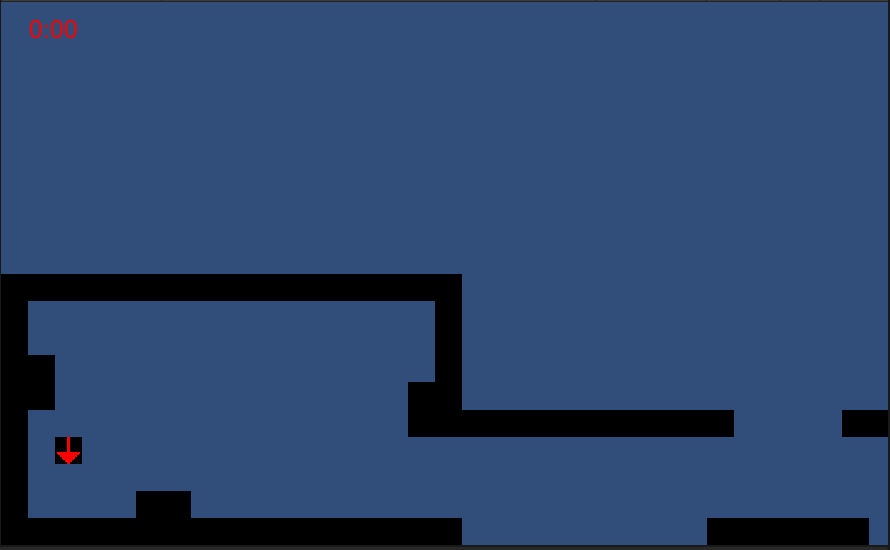
Though the game's graphics are simple and maybe a little too basic, I don't want to make them too much more complex as that could defeat the idea of "teach by showing, rather than telling" idea I'm trying to go for and make it more complex for people to understand without having to read a manual or something of that sort.
See you in the next devlog!
Leave a comment
Log in with itch.io to leave a comment.