Devlog #6: —Updates based upon Testing Session
A game may be created by a developer/team of developers but without testing it risks facing issues developers are blinded to that new players/non-devs will not be, so its important to run testing sessions to make sure that everything feels good to play and experience
During the testing session a google form was created to query the experiences of testers to help refine the direction of development for the game. The feedback for Gravity Bender was overall very positive, however there were some issues that were noted, so I'll explain them and my solution to them below
Issue: The player should have an indication of when they're able to change gravity
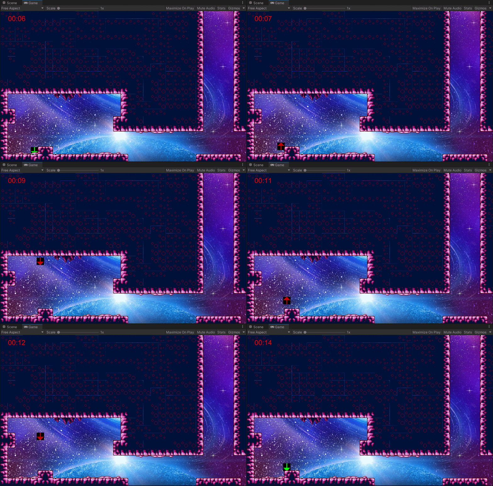
Solution: I made multiple changes here to make it easier to understand what was going on, the first change is visual, the "gravity direction" arrow will be green when a gravity change action can happen and a dim red when it cannot happen, the idea is to use the common knowledge that "green = go" and "red = stop" to convey the mechanics without any text prompts. Though, even this may not quite get the idea across, so I added a secondary "tell", whenever the player changes gravity a "swap" sfx will play, letting the player know they changed gravity. If the player attemps to change gravity when the arrow is red a "swapFail" sfx will play, letting the player know the action is unavaliable
Issue: The game would feel better with better (non-temp) art
Solution: while thinking about what kind of art style would work best for the game and constantly coming up blank, I had the thought that "the levels kinda looked like they're floating in space", so I put in a cool space bg image to see if it'd fit and it totally did! but the game wouldn't truely look the part if it was just a cool bg image and black boxes for stage geometry, so I outfitted the stages with part of the tileset from metroid zero mission's norfair area to give a kind of "asteroid"/"floating in space" vibe and I think it totally worked!
Issue: the gravity swap "lines" don't convey their mechanics very well
Solution: I've added a "swap" sounding sfx when gravity changes to let the player know whats happening, but even that may not be enough, so I am looking into potential art that I could use to show the idea of the gimmick as well
Issue (found during personal testing): Doors can be kinda hard to see in some situations, plus they can be a pain gameplay wise
Solution(s): I set the "red" channel to oscillate based on a sine wave using Time.Time so the door is now more visible in all situations since it's dynamically changing colour, the only other thing that has that ability is the player's gravity arrow. I've also widened the collider for the door to make it easier to access AND added an sfx for "entering" the door, letting the player know their inputs went through.

This is the last main (planned) devlog so I hope you've enjoyed my ramblings and I especially hope you find Gravity Bender fun to play!
Gravity Bender
| Status | In development |
| Author | Rubberduckycooly |
| Genre | Platformer |
More posts
- Documentation + User GuideMay 30, 2021
- Devlog #5: User Interface/PolishMay 25, 2021
- Devlog #4: Presentation & GraphicsMay 25, 2021
- Devlog #3: Interactions, Puzzles & GimmicksMay 09, 2021
- Devlog #2: Level BlockingMay 09, 2021
- Devlog #1: Player movementApr 27, 2021
- Game ConceptApr 16, 2021
Leave a comment
Log in with itch.io to leave a comment.