Devlog #5: User Interface/Polish
As the development timeline nears its end, it only makes sense to talk about polish and the user interface for the game
As mentioned in the last post, the presentation is intentionally being kept simple to make it easy to understand how everything works, and as you'd expect the user interface is no different, with only a simple stage timer on the HUD and no other major UI elements at all, not even a title screen. The reason for this choice is, as expected; so focus can be on the gameplay rather than any extra UI elements that wouldn't make the game any more interesting or enjoyable. I may add a very simple pause menu/feature for convinience since that would be beneficial to the user experience.
and with the time saved by cutting down unnecessary elements of the game I've been able to polish up the game and refine everything up till now. Prominent examples of this being platforms, doors and the camera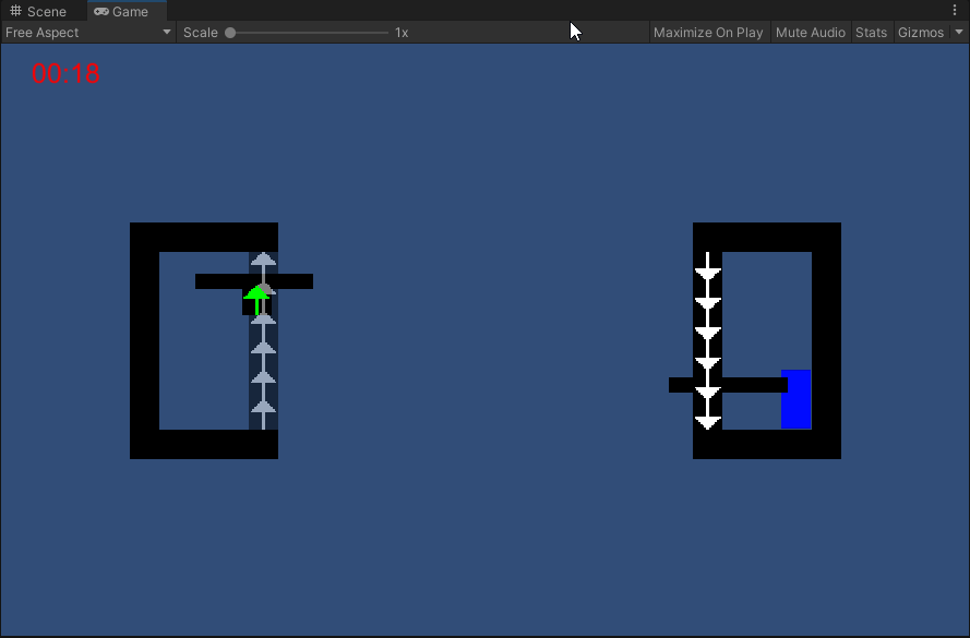
- Platforms now have much smoother collision and hopefully won't bug out as much as before, leading to a smoother gameplay experience
- Doors are now blue (subject to change) so they stand out more, the collider that checks player interactions is now wider which allows for more lenience in relation to inputs and triggering the stage exit sequence
- Camera has now been switched over to a cinemachine-based setup, it should behave exactly like before, however now it has the added benefit of being able to have boundaries set. This is demonstrated in the gif above, as the stage is small enough to all be on screen at once there's no need for the camera to follow the player, so instead its locked to a fixed location that shows the entire stage AND player
Polishing a game is a constant process so I'm sure there's going to be more work to do as more feedback comes in about the game and its features.
See you in the next devlog!
Leave a comment
Log in with itch.io to leave a comment.